0 members and 7,121 guests
No Members online

» Site Navigation

» Stats
Members: 35,442
Threads: 103,075
Posts: 826,688
Top Poster: cc.RadillacVIII (7,429)
|
-
 wow... wow...
haven't done ps for a loong time...like almost a year?
anyways, made one.
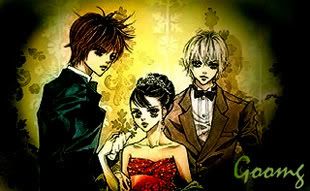
Yeah. it's supposed to look old, vintage, and like an old portrait...so that explains the color and effects...hopefully.
Last edited by mikasa; 10-20-2007 at 01:54 AM.
-
I'm not really a fan of the circular black border. Also the text is really distracting, see if you can blend it in more by making it smaller and lining it up with something.
I can kind of see the whole portrait thing..Its different for a sig not commonly done, it came out different, but it's kind of a refreshing change from the usual. Keep working with it, I wanna see more stuff like this.
 My DevART
RATCHET is my bitch
Andrew says:
u ever stolen a bible?
Apathy says:
no
used the last two pages to roll a joint though
Andrew says:
wow
thats fucking hard core
^^HAHAHA, dm sucks XD
-
thanks...I really need to start working with photoshop again.
=u='
-
how do you that? drow, stock or what?
-
I'm not sure...it's either just an effect, or I went to adjustments or I did a crap load of all these things.
-
I like how different it is. Not a bad colour choice, I can see like the "old" style type thing going on. Im not feeling the circular black outline thing you have going on there. But it is interesting, good job 
-
wow, you should make a tut, i mean on the render effects... or did the renders just come like that?
new 
fav 
 Posting Permissions
- You may not post new threads
- You may not post replies
- You may not post attachments
- You may not edit your posts
-
Forum Rules
|


 Reply With Quote


