0 members and 7,624 guests
No Members online

» Site Navigation

» Stats
Members: 35,442
Threads: 103,075
Posts: 826,688
Top Poster: cc.RadillacVIII (7,429)
|
-
11-28-2007, 05:34 AM
#1271

hmph. very crude. shows your immaturity, but nevertheless youve used some good effects. i dont particularly like your mix of different styles(the lines, abstract and then vectors) the lines at the top look a bit too thick, and arent subtle enough for my taste. i like the way youve used the stock but the tech to the left doesnt really suit it. the red colouring is extremely effective.. but you havent done the sig justice with all the profanity.
5.5/10
.>current


-
11-28-2007, 01:21 PM
#1272
hmm. thanks.. very criticly... 
Yeah. i see that I made mistake with bordering.. really I need to change the abstract one... But I think Lines fits here
and... Yes.. I know its not nice to use such a words, but with this idea I wanted to show that not everything is so nice in this world... I wanted to write WAR on her mouth But I thinked that its not fits here so much... I see that I dont like to you now, but this is your way to choose
yours? hm... I like the bg of first... also that astract on the right... nice work... But I think its really can be more interesting
6,5-7/10
and second one? nice idea, but i dont like it... its so.. hm.. dunno how to say, but this is not my taste of sig.. maybe for others this is really good, but not for me.. sorry 4,5/10
-
12-01-2007, 01:58 PM
#1273
duno if i've rated it before, but anyways..
I like it... ALthough i still think the white part ruins a lot of the sig. It stands out to much. The text is suiting IMO, but remove the white, and move the text to another place... Only what i think
6/10
-
12-01-2007, 02:34 PM
#1274
nice. it has a great flow and a cool sparkly effect

ukgraphics.net/forum - GFX, CAWs, More
-
12-01-2007, 02:54 PM
#1275
 Originally Posted by TheWarzone1

nice. it has a great flow and a cool sparkly effect
You didnt rate his?
5/10 text and blending and also placement.
-
12-03-2007, 10:41 AM
#1276
-
12-03-2007, 07:31 PM
#1277
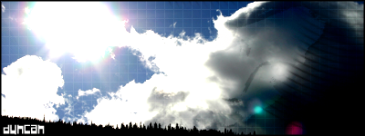
1st: the grid and text are a bit annoying...but not bad. 7/10
2nd: nice colors but sorta bland, unless theres a concpet im missing
-
12-03-2007, 11:27 PM
#1278
9/10 the best sprite i have seen.
8/10 looks kewl to
-
12-03-2007, 11:43 PM
#1279
I like the idea, but think the render is a little too centered on both, and colors are good.
7.2/9 on first
7.8/9 on second.

Commissions and stickers available via linktree here.
-
12-04-2007, 07:11 AM
#1280
I'm seeing the girl with a black and pink bass guitar.
It's superbly drawn and the simplicity of it is gorgeous. I don't like the chunky white background though. 7/10
Similar Threads
-
By SgtSwabs in forum The Void
Replies: 16
Last Post: 12-06-2005, 08:42 PM
-
By LunarPoet in forum Sigs & Manips
Replies: 1
Last Post: 06-23-2005, 12:31 PM
-
By Xavier in forum Sigs & Manips
Replies: 8
Last Post: 06-03-2005, 01:46 AM
 Posting Permissions
- You may not post new threads
- You may not post replies
- You may not post attachments
- You may not edit your posts
-
Forum Rules
|


 Reply With Quote