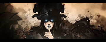
im sorry to say but im not so crazy with this sig. The tex is to big and stands out too much. The render is very small and you haven't blended him in at all. The bg dont look all that bad but it looks like you just slammed on some c4d's and then changed the colors. This was in no mean way.
here are some stuff to work on for you.
1. blending
2. bg (more details, more interresting look)
3. (dont make your render that small better to get it a bit larger and loose some of the body.
4. Light, you can see light on the guys face but you dont have a light source in there
When that is said and done it is not to bad for one of your first
I would try some more tut's if i were you, i have some pretty goo beginner tut in signature tutorial section. Pappa have a good halo one to.
Daemon
ps Welcome to the void looking forward to knowing you.


 Reply With Quote