0 members and 8,642 guests
No Members online

» Site Navigation

» Stats
Members: 35,442
Threads: 103,075
Posts: 826,688
Top Poster: cc.RadillacVIII (7,429)
|
-
12-13-2007, 04:28 AM
#1291

mm. Nice border, good effects... 
7,5/10
-
12-13-2007, 06:01 AM
#1292
6.5/10
nice. a few strokes at the top right corner of the border look weird.
The borders would look better if they were square as well.
-
12-13-2007, 06:57 AM
#1293
mmm. thanks
9,5/10
and
9,5/10
those two are kinda similar to each other, same bgs nad colors
-
12-15-2007, 05:50 PM
#1294
neato concept, and execution is decent. but i would like to see some effects in the sig itself, rather than just a fancy border =D
-
12-16-2007, 05:00 AM
#1295
 Originally Posted by s0ggywaffls

neato concept, and execution is decent. but i would like to see some effects in the sig itself, rather than just a fancy border =D
so rate???
-
12-16-2007, 05:22 AM
#1296
i would give it 8/10 it nice sig and kewl concept but a little more effects would be nice. make her legs and soks fading away too like the stomach
-
12-16-2007, 02:25 PM
#1297
baby moon 10/10 great effects and very well blended.
the darkness 10/10 (i would love to see a tut on this one it's great)
-
12-16-2007, 02:57 PM
#1298
ill give it a 8.5/10
seems a little too plain
-
12-16-2007, 07:22 PM
#1299
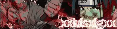
6.5/10 theres not much too it, and idk if its just me but i dont like how the guy on the left looks... and theres no backround is there?
EDIT; ty fyasko, yeh, i tried to make it as red as i could, and i was thinkin of putting some blood spater on there but i didnt want to, cuz it didnt go w/ the background.. and the lettering thing i got from a tut in here...
Last edited by Tain; 12-16-2007 at 09:55 PM.
new 
fav 
-
12-16-2007, 07:39 PM
#1300
5/10
The render is sick, but the background is so simple it makes it look bad. The pink coloring doesn't really flow, I feel like it should be red, blood red, if you will. The random grey spot? I'm not sure. And the "Show No Mercy" text should definitely be consistent coloring, you can hardly read the beginning letters to each word.
Needs Improvement. :|
Similar Threads
-
By SgtSwabs in forum The Void
Replies: 16
Last Post: 12-06-2005, 08:42 PM
-
By LunarPoet in forum Sigs & Manips
Replies: 1
Last Post: 06-23-2005, 12:31 PM
-
By Xavier in forum Sigs & Manips
Replies: 8
Last Post: 06-03-2005, 01:46 AM
 Posting Permissions
- You may not post new threads
- You may not post replies
- You may not post attachments
- You may not edit your posts
-
Forum Rules
|


 Reply With Quote


![f y a s [k] o's Avatar](image.php?u=7339&dateline=1168833522)
