0 members and 26,370 guests
No Members online

» Site Navigation

» Stats

Members: 35,442
Threads: 103,075
Posts: 826,688
Top Poster: cc.RadillacVIII (7,429)
|
-
 CnC | iRobot CnC | iRobot
-

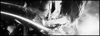
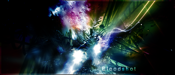
I hve to say I prefer it in color. I definitely like it, good blending - I just can't read whatever that is below the awesome font you used for Will Smith. I think that the right side could be a bit...more colorful r something, or just have something in it, but apart from that, gj
-konfusion
-

The pulse font isn't working very well for me, i would say just stick to nomal fonts. The green looks kinda odd next to all the red, maybe saturate it a bit more and it's be a lot better. Those are my only crits though, ncie job on everythign else.
 My DevART
RATCHET is my bitch
Andrew says:
u ever stolen a bible?
Apathy says:
no
used the last two pages to roll a joint though
Andrew says:
wow
thats fucking hard core
^^HAHAHA, dm sucks XD
-

Redoing the font in a little bit.
-
-

i agree with new i to isnt all that happy with just head popping out, but its a solid sig, and you manged to use the purple clor without getting it to monotone. solid sig here, the only thing i really dislike is the text. not the one saying will smith but the other. its to hard to read.
-

I like it b&w is better for me in some aspects some not
its a bit of a bad transition tho, between the colors and stuff
nice effects around the focal as always, couldve had some more shoulder showing and needs some cooler lighting
perhaps shorten it about 15 pixels inwards to the left.
pretty good job.
:Latest:

:Favorite:

 Posting Permissions
- You may not post new threads
- You may not post replies
- You may not post attachments
- You may not edit your posts
-
Forum Rules
|

