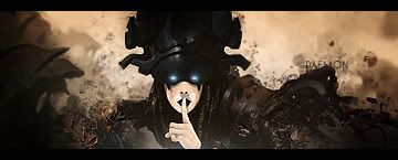
No comments yet:O. first of all i think tou overdid the brush things a bit. And the bg need some work i can clearly see the c4d that was used. About the text, the texst looks fair but its placed bad, it almost never looks good in a corner. I wouldnt know what place would be good since most of ng is filled with splatter. But it is defently better than your current and you seem to improove your sig making. keep the work comming


 Reply With Quote