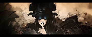
Well i dont think this is all that bad just add a cenima border and blend the render in a bit maybe aa gradient map on bg erase some over focal and then dont make the sigs that tall its a bit tall. Thx for trying.
Well i think a little cenima border would suit this sig. The text isnt that good, since you have such a loong name try to find a nickname, and also lower opacity of scanlines a bit. Nice job on this though looks good better than the currentsthx


