0 members and 26,370 guests
No Members online

» Site Navigation

» Stats
Members: 35,442
Threads: 103,075
Posts: 826,688
Top Poster: cc.RadillacVIII (7,429)
|
-
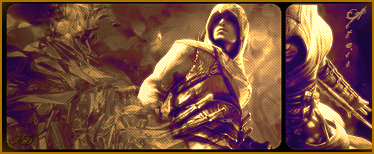
 Altair (Assassins Creed) SIG Altair (Assassins Creed) SIG
-
Not really my style... The flow looks good, but i think you should use some more colors...
-
The colors kill it for me.
gj on the bg. text to the right is a bit too big. and as mentioned, keep to defaults, or dowloadable who looks like defaults.
gj still keep it up^^ keep it up^^
-
should I say it again?....no scan lines
other than that, what SS said above.
-
Seems liek you have a lot of Purple/orange gradient maps going here. Thats fine i use em all the time, but I think we need a different choiuce in color. SO i would try and get rid of a couple of those gradient maps and such and try ot rbgin out the color you had in the sig before.
I agree with studhorse some scanlines are good, however i wouldn't do scanlines over the whole sig.
I do like the clipping mask on the side that looks very cool, gives it kind of a second dimension.
As far as text goes i would try use a font like eurose, acens, or arial. I have a bunch of downloaded fonts that look like they are defaults and they work pretty well, if you want em just talk to me on MSN ill send em over to ya. * my msn is in my profile.
GJ your getting a lot better just work on your coloring mostly.
 My DevART
RATCHET is my bitch
Andrew says:
u ever stolen a bible?
Apathy says:
no
used the last two pages to roll a joint though
Andrew says:
wow
thats fucking hard core
^^HAHAHA, dm sucks XD
-
Yes, i have that problem wit colors ... im gonna work on that ... anyways thanks ...
Similar Threads
-
By Ruins Of Tomorrow in forum Sigs & Manips
Replies: 2
Last Post: 05-15-2007, 05:25 PM
-
By Hip Hop in forum Sigs & Manips
Replies: 4
Last Post: 03-04-2007, 02:26 PM
-
By Shamino in forum Sigs & Manips
Replies: 6
Last Post: 11-03-2006, 08:47 PM
-
By Arkanian in forum Sigs & Manips
Replies: 6
Last Post: 06-21-2006, 07:18 PM
 Posting Permissions
- You may not post new threads
- You may not post replies
- You may not post attachments
- You may not edit your posts
-
Forum Rules
|


 Reply With Quote


