I agree with Psypher
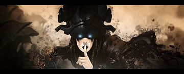
Try to erase some of the effects over the cut outs, because it makes the sig looks kinda flat, and lack of depth, I like the first one, just move those effects, and the second one is not my cup of tea since i think its a bit to messy, colors are to different to work together try to match them a bit more.


 Reply With Quote