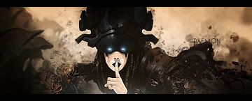
I think there is way to much empty space in the sig, the text effects are kewl, but i think it takes to much focal from the cut out. i like the colors and the effects over it, but i think there could be a bit more bg, so that you could blend him in a bit more.


 Reply With Quote