0 members and 680 guests
No Members online

» Site Navigation

» Stats
Members: 35,442
Threads: 103,075
Posts: 826,688
Top Poster: cc.RadillacVIII (7,429)
|
-
 Ratchets ironman sig Ratchets ironman sig
I know there have been a few about, but after seeing immortals it inspired me to do one.
Heres my effort : 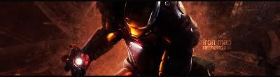
Cnc would be appreciated.
-
needs lighting,
needs some blending.
more depth, as the bg is just boring and flat. and the render is too dark.
but your text is pretty decent.
-
It needs a lot of blending. The text isnt too bad. It definitly needs a lightsource though, its way too dark.
 My DevART
RATCHET is my bitch
Andrew says:
u ever stolen a bible?
Apathy says:
no
used the last two pages to roll a joint though
Andrew says:
wow
thats fucking hard core
^^HAHAHA, dm sucks XD
-
well prety much nazz said it all keep on keeping on :-P
-
blend it in..urs is sweet
good job man
-
I'll try and fix it tonight. 
-
-
V2:
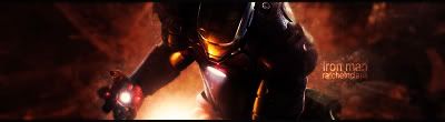
Any better?
-
a bit..again..blend it in more..
and i think you should lighten up the render more..
dodge tool it..
-
still way to dark, blend it a little better and work on the light source a little
Similar Threads
-
By Raditz in forum Sigs & Manips
Replies: 7
Last Post: 05-08-2008, 09:00 PM
-
By ratchetnclank in forum Digital Art
Replies: 12
Last Post: 04-25-2008, 07:42 AM
-
By Psypher in forum Sigs & Manips
Replies: 2
Last Post: 04-24-2008, 04:03 AM
-
By ratchetnclank in forum Sigs & Manips
Replies: 1
Last Post: 04-10-2008, 05:40 AM
-
By -Unreal- in forum Sigs & Manips
Replies: 1
Last Post: 12-12-2006, 08:26 AM
 Posting Permissions
- You may not post new threads
- You may not post replies
- You may not post attachments
- You may not edit your posts
-
Forum Rules
|


 Reply With Quote


