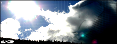
GFXVoid Graphic Design Forum

Remove Text Formatting
Loading...

» Online Users: 17,484

0 members and 17,484 guests
No Members online

» Site Navigation

 > FAQ

» Stats

Members: 35,442
Threads: 103,075
Posts: 826,688
Top Poster: cc.RadillacVIII (7,429)
Welcome to our newest member, Lekelindids
Page 149 of 496 FirstFirst ... 4999139147148149150151159199249 ... LastLast
Results 1,481 to 1,490 of 4959
  1. #1481
    Join Date
    Feb 2008
    Location
    Toronto, Canada
    Posts
    4,831

    Default

    7/10 not too bad
    8.5/10 for mewtwo..sweet effects nice flow


  2. #1482
    Join Date
    Jul 2007
    Location
    Lithuania
    Posts
    3,611

    Default

    7,2/10 a bit boring
    7,8/10 render is oversharpen a little, need work on right side


  3. #1483
    Join Date
    Feb 2008
    Location
    Toronto, Canada
    Posts
    4,831

    Default

    7/10 pretty cool stuff


  4. #1484
    Join Date
    May 2008
    Posts
    15

    Default

    9/10 love these sigs v.nice

  5. #1485
    Join Date
    Oct 2007
    Posts
    2,782

    Default

    7.2/10 love the border and background simple but good.
    6/10 looks good although gradient map seems a bit strong.

    Text needs work in both


  6. #1486
    Join Date
    May 2008
    Location
    Anchorage, AK
    Posts
    440

    Default

    We just rating the sig above us?

    If so I would say 8/10 cause its a nice smooth flow, and that is just an awesome picture of a raccoon.
    Fav:

    M-Birds = Godly

  7. #1487
    Join Date
    May 2008
    Location
    Everywhere
    Posts
    51

    Default

    I like the idea but the piece on the left isn't blended in very well. I mean... There's a bright spot right under it and makes it look not there. If you work on blending in that peice it will be 9.5/10 but at the point its in right now idhave to say 7/10.
    It only matters how good it looks not all the operations used to get it.
    Most Recent:


  8. #1488
    Join Date
    Nov 2006
    Location
    South London, UK
    Posts
    187

    Default

    8/10
    6/10
    Winner of SOTW #75


  9. #1489
    Join Date
    Feb 2008
    Location
    Toronto, Canada
    Posts
    4,831

    Default

    7/10
    6/10
    nice text on the bottom one tho..i like the font


  10. #1490
    Join Date
    Jul 2007
    Location
    Lithuania
    Posts
    3,611

    Default

    7/10 too monotonic
    7,6/10 oversharpened


Similar Threads

  1. Rate The Sig Above!
    By SgtSwabs in forum The Void
    Replies: 16
    Last Post: 12-06-2005, 08:42 PM
  2. *NEW* Rate Avatar? Rate Sig?
    By LunarPoet in forum Sigs & Manips
    Replies: 1
    Last Post: 06-23-2005, 12:31 PM
  3. Rate my Signature...
    By Xavier in forum Sigs & Manips
    Replies: 8
    Last Post: 06-03-2005, 01:46 AM

Posting Permissions

  • You may not post new threads
  • You may not post replies
  • You may not post attachments
  • You may not edit your posts
  •  
Powered by vBadvanced CMPS v4.1.1