0 members and 1,707 guests
No Members online

» Site Navigation

» Stats
Members: 35,442
Threads: 103,075
Posts: 826,688
Top Poster: cc.RadillacVIII (7,429)
|
-


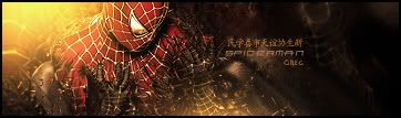
Alright heres the newer version, what should or could I possibly do with the text?
-
-
A little bit too much blurring for me. i can see what you done though. you should have set your gradient map (imma assume thats what you did put on) layer a little lower just to get that effect that you wanted. and then maybe darkened around your render, and THEN blurred. that way it wouldn't look so blurry. i can see what your going for though. maybe what you could also try. is to back up a few steps, before you added the gradient, and the blurr, and maybe add a few cloud brushes around him, or another c4d render, to give it more detail, and to make it less contrasted. then do everything again, and still turn the blur down a bit. overall night sig, just that one thing for me i don't like. good job though =)
-
Also for the text. yea like ratchet said, take one of the main color in your picture, and eye drop that, and use that as your text color. try moving it in a little closer to your character too. it kinda draws the viewers eyes away from the detail that you want them to see. in a little and up a little tiny bit. shoud fix it up  . nice font choice btw. i really like that font. waht is it? . nice font choice btw. i really like that font. waht is it?
-
lol why does everyone keep saying something bout blur, theres a blur layer but its at like 20%. Im not sure if a cloud layer would look good, may mess up the background a little bit; but could give some things a shot; as for the contrast, its really the render, thats why I brightened up the background as well; thanks for the tips though. As for the text thats what I was thinking of doing, just cant get a right color (too many to choose from :P) and none of them really seem to fit in. I can see what font it is later on, think it might be a windows font.
-
Kk I could see where you were kind of talking about it being a little blurred Gamak so I deleted the layer, looked better without it. As well tried to find a good color for the text, may still need some work, but the position I think is good.

Also, the font is just a windows font, Aerial Bold I believe it was.
-
-
WAYYYYYYYYYYY better dude. Nice fuckin job. text is a little hard to read. you should try one of his chest colors. sorta poppy. and maybe put a outerglow on it. that should spice it up. gj though way better.
-
Yea I was trying to find one on the render, just it seems like it was either white or black, but maybe if i can get a nice smooth silver color and such will make it better. Thanks for the tips though appreciate it alot.
Should I possibly current it?
-

Fixed the text, tried to find a nice light color (closest I could find) and added a light outerglow.
Similar Threads
-
By Immortal. in forum Sigs & Manips
Replies: 5
Last Post: 05-07-2008, 08:11 AM
-
By Studhorse in forum Sigs & Manips
Replies: 3
Last Post: 02-28-2008, 10:42 AM
-
By RONIN in forum Sigs & Manips
Replies: 7
Last Post: 08-10-2007, 08:46 AM
-
By Nightfire in forum Battlegrounds
Replies: 22
Last Post: 08-03-2005, 04:40 PM
-
By HeadShot in forum Sigs & Manips
Replies: 3
Last Post: 07-30-2005, 07:47 PM
 Posting Permissions
- You may not post new threads
- You may not post replies
- You may not post attachments
- You may not edit your posts
-
Forum Rules
|


 Reply With Quote