0 members and 483 guests
No Members online

» Site Navigation

» Stats
Members: 35,442
Threads: 103,075
Posts: 826,688
Top Poster: cc.RadillacVIII (7,429)
|
-
 2 new ones 2 new ones
Last edited by Goat; 06-08-2008 at 03:32 PM.
-
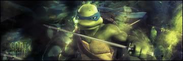
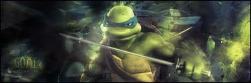
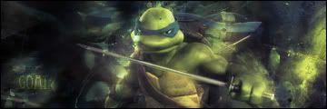
that ninja turtle one has a lot of potential.
i dont like the reflection text. the sword is transparent halfway. and it could use some lighting
-
i added some more versions 
-
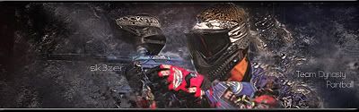
i'm lovin the paintball sigs, i shoot a dm7
-
For turtle sig V1 with V2's text.
The Bg is pretty cool. However i feel like there is a lot going on in it. You should blur parts of it a bit more, and sharpen the turtle a lot. I also think it needs a bit of contrast. It's kind of foggy and would add more drama to the sig if you add a nice levels to it.
IMO i think you should take a large 0%hardness low opacity black brush, and brush around the corners a bit. Make it darker so that the viewer HAS to look at the turtle. I think this will help make the dynamics a lot better.
The font on this is kind of odd. You should stick to default fonts, i don't know if this one is or not, but usually sanserif font's are pretty nice. They work really well too so you migth wanna look for those.
The coloring on this is looking pretty good, not monotone at all which i'm liking so nice job on that.
Finally i think you need more blending. I don't see much blending and i think for that reason it's lacking. The Bg is made out of the turtle so unit them together.
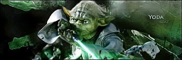
The yoda sig is pretty sweet, I don't have much to add cause i don't really know how i'd make it better. I'd say just do what i said above and like check things off if they look good.
GJ though.
 My DevART
RATCHET is my bitch
Andrew says:
u ever stolen a bible?
Apathy says:
no
used the last two pages to roll a joint though
Andrew says:
wow
thats fucking hard core
^^HAHAHA, dm sucks XD
-
 Originally Posted by sk3zer

i shoot a dm7
u my hero lol
 Posting Permissions
- You may not post new threads
- You may not post replies
- You may not post attachments
- You may not edit your posts
-
Forum Rules
|


 ::new::
 ::fav::

 Reply With Quote