0 members and 640 guests
No Members online

» Site Navigation

» Stats
Members: 35,442
Threads: 103,075
Posts: 826,688
Top Poster: cc.RadillacVIII (7,429)
|
-
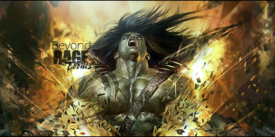
 Rage... Rage...
-
how is it that u make all ur sig look so damned good?
love the effects...as well as the colours
text is pretty well done as well
top job my friend
-
You're best.
easily 
Love it man.
-
thanks guys. Happy with result. Just think it is missing something? maybe more depth needed?
-
Actually depth is pretty much spot on, as well as text. Love the effects, maybe blend the arms at the bottom left and right? Not quite sure but fantastic work.
-
You Topaz'n Mf'ers
Gotta get that and check it out.
-
lol topaz ftfw xD lawl xD great job love it
newest:

Fav :

The true and only Firescorpio!
(no autographs please)
-
This looks AWESOME. My only critique is that i don't really agree with the lighting. If you look at his face it's actually supposed to be more towards the left side of the sig. But ya know I'm kinda just it-picking for something to critique :P.
 My DevART
RATCHET is my bitch
Andrew says:
u ever stolen a bible?
Apathy says:
no
used the last two pages to roll a joint though
Andrew says:
wow
thats fucking hard core
^^HAHAHA, dm sucks XD
-
looks insane great job i just hate that it is that tall ;p effects are nice and blending aswell great.
-
5/5 10/10 2 thumbs up 100% what more can i say
Similar Threads
-
By Devon in forum Sigs & Manips
Replies: 4
Last Post: 11-15-2007, 03:52 PM
-
By LoganGFX in forum Sigs & Manips
Replies: 7
Last Post: 04-03-2007, 03:43 AM
-
By Sp0rk-eh in forum The Void
Replies: 5
Last Post: 05-23-2005, 07:34 PM
-
By -Kanji- in forum Sigs & Manips
Replies: 3
Last Post: 03-21-2005, 11:29 PM
-
By Morphius in forum Sigs & Manips
Replies: 17
Last Post: 02-21-2005, 10:30 PM
 Posting Permissions
- You may not post new threads
- You may not post replies
- You may not post attachments
- You may not edit your posts
-
Forum Rules
|


 Reply With Quote


