0 members and 734 guests
No Members online

» Site Navigation

» Stats
Members: 35,442
Threads: 103,075
Posts: 826,688
Top Poster: cc.RadillacVIII (7,429)
|
-

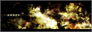
Made for Rookie's contest at tracker as abstract. More to come.
Original Climb-X Co-Founder
-
Looking good Krazy, but it looks a little too dark imo. But hey who the hell am I to judge someone's work! Lol! 8/10
-
I kind of like the darkness, and all in all it's a great sig. I was just thinking that it might be cooler with some brushing that makes the yellowish parts jump out at you more (like 3Dish). But I still like it, I'd problably say 8/10.
-
wow, i'll take it if you dont want it, lol it owns
-
love it?, can u teach me how u do ur color? like make a tut.
-
thanks, any more comments?
Original Climb-X Co-Founder
-
Text is kinda plain is all, I like it, just kinda plain
-
Is it just me or there's high contrast?
probably just me...
-
nice sig i liek it alot just not liking the text that much but id say 8/10 as someone sed be4
-
Originally posted by Joker.@Jun 15 2005, 02:14 AM
Looking good Krazy, but it looks a little too dark imo. But hey who the hell am I to judge someone's work! Lol! 8/10
[snapback]43046[/snapback]
totally agree !!!! 
 Posting Permissions
- You may not post new threads
- You may not post replies
- You may not post attachments
- You may not edit your posts
-
Forum Rules
|


 Reply With Quote