0 members and 1,228 guests
No Members online

» Site Navigation

» Stats
Members: 35,442
Threads: 103,075
Posts: 826,688
Top Poster: cc.RadillacVIII (7,429)
|
View Poll Results: Who's graphic is better?
- Voters
- 14. You may not vote on this poll
-

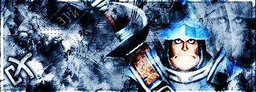
Electrick - SO un-original, this has been whored over and over again, try something new, also some spots are way to bring.
Ej - alittle to much contrast, trying getting multi-colored sigs in there, it will make it alot better. Also try getting a 1 pixel border, with everything overlaying it doesnt look to unique
bored - your render doesnt blend well, the tech shape doesnt even fit the grunge type of sig it is, and the text with its glow doesnt blend well at all
THEY ALL NEED WORK, BUT MY VOTE goes too...
eletrik...... just overall better not even in the same league, if one of you made a original sig, you definatley would of got my vote.
-
Eep! Sorry about that Trunks  Won't happen again Won't happen again 
-
I never used that render or saw a graphic with it in it. I liked the render.
-
Ej - alittle to much contrast, trying getting multi-colored sigs in there, it will make it alot better. Also try getting a 1 pixel border, with everything overlaying it doesnt look to unique
lol ya I suck at grunge not my fav style and I gotta work more on contrast sh*t LOL...elektrics sig does look good but I as SS said style is too whored :/ :P specially the render lol reminds me of dante's render whored to dead too :/
@ bor3d sig is good but those lines kinda like killed it cuz it doesnt go with the theme/style of sig..and text might need somework
well it was a fun battle congrats elektrik I guess 
-
-
Lol, you dont have to be sorry for anything, i was just giving you advice so you can improve =)
-
Originally posted by b0r3d@Jul 12 2005, 08:48 AM
agreed,* wanna go again?
[snapback]55271[/snapback]
sure thing mate
-
Ill stay outta this one so its a more even battle
-
good luck with the new battle.
 Posting Permissions
- You may not post new threads
- You may not post replies
- You may not post attachments
- You may not edit your posts
-
Forum Rules
|