GFXVoid Graphic Design Forum

Remove Text Formatting
Loading...

» Online Users: 26,370

0 members and 26,370 guests
No Members online

» Site Navigation

 > FAQ

» Stats

Members: 35,442
Threads: 103,075
Posts: 826,688
Top Poster: cc.RadillacVIII (7,429)
Welcome to our newest member, Lekelindids
Page 1 of 2 12 LastLast
Results 1 to 10 of 14

Thread: Corrupt

  1. #1
    Join Date
    May 2005
    Location
    Texas.
    Posts
    1,584

    Default


    CnC?

    Current Tag:


    Are you a deviant?
    I am
    www.firetap.deviantart.com


  2. #2
    Join Date
    Jul 2005
    Posts
    69

    Default

    I love it mate, love the over depth.

  3. #3
    Join Date
    May 2005
    Location
    Warwickshire, UK (Near Shakespeare's house)
    Posts
    508

    Default

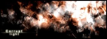
    Could do with some major sharpening. It's really out of focus. It also has no focal point, which could be a problem. If you took off the yellow outer glow on the text and made it white, then put the text underneath the colour balance layers I think it would look better, but it does look ok now.

  4. #4
    Join Date
    Jul 2005
    Posts
    53

    Default

    what ^ said looks great bro.

  5. #5
    Join Date
    Jul 2005
    Posts
    11

    Default

    Storm bushes?

    Very nice. Don't know what else to say B)

  6. #6
    Join Date
    Jun 2005
    Location
    NSW, Australia
    Posts
    3,262

    Default

    Sweet! I love your work octane!

  7. #7
    Join Date
    Jul 2005
    Location
    Virginia
    Posts
    1,667

    Default

    Love it man great job.

  8. #8
    Join Date
    May 2005
    Location
    Texas.
    Posts
    1,584

    Default

    Originally posted by Ardeo@Jul 29 2005, 02:05 AM
    Sweet! I love your work octane!
    [snapback]62777[/snapback]

    I have a fan!


    Thanks for all the good comments guys!
    Current Tag:


    Are you a deviant?
    I am
    www.firetap.deviantart.com


  9. #9
    Join Date
    Jul 2005
    Location
    jakarta
    Posts
    183

    Default

    nice depth octane i like it

  10. #10
    Join Date
    Apr 2005
    Location
    Scotland
    Posts
    2,177

    Default

    i think its gud but i wud sharpen it a bit.

Posting Permissions

  • You may not post new threads
  • You may not post replies
  • You may not post attachments
  • You may not edit your posts
  •  
Powered by vBadvanced CMPS v4.1.1