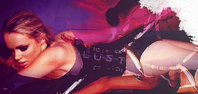
In truth I like the black and white one better. =p
As for the manip though I don't really care for it. It doesn't really have any style to it. Just seems like a basic color balance layer, motion blur thing most people do. Though I'm sure its more than that. Maybe try adding to it a bit. Effects or something to make it different from the original by more than just color. Plus take off the typo it doesn't fit at all.
I mean for a first it isn't to bad. But take that idea and keep working with it and build upon it and it could be rather nice.


 Reply With Quote