0 members and 8,611 guests
No Members online

» Site Navigation

» Stats
Members: 35,442
Threads: 103,075
Posts: 826,688
Top Poster: cc.RadillacVIII (7,429)
|
-

comments
-
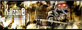
Looks cool, great job. What text is that? 
-
thats pretty nice, you have a really nice and unique style. It allmsot looks like abstract/Photomanipulation. Anyways its all ncie, text could use soem work but other than that its awsome, gj
-
I hate how you have the widescreen type border on there and the white px border.
-
i like it...love the sense of depth
-
That is one of the best killzone signatures i've ever seen, or even the best. It's awesome! Has great text, great brushing, and you've put nice depth into it.
Great job!
-
that is just frikkin awesome!
i'm a huge fan of Killzone, so of course, it appealed to me. but i'm pretty sure you got skills, even if it was another type of sig it would look cool. you wouldn't happen to have a tut on how to make a sig like that somewhere, would ya? ^___^;;
-
thx all..didn´t do a tut........yet
-
Looks good.. but render shouldn't be see thru.. I feel the text is ok except for the "e" on the "killzone".. But that's just me.. :P
-
great job i like it.
 Posting Permissions
- You may not post new threads
- You may not post replies
- You may not post attachments
- You may not edit your posts
-
Forum Rules
|


 Reply With Quote


