GFXVoid Graphic Design Forum

Remove Text Formatting
Loading...

» Online Users: 11,912

0 members and 11,912 guests
No Members online

» Site Navigation

 > FAQ

» Stats

Members: 35,442
Threads: 103,075
Posts: 826,688
Top Poster: cc.RadillacVIII (7,429)
Welcome to our newest member, Lekelindids
Page 1 of 2 12 LastLast
Results 1 to 10 of 14
  1. #1
    Join Date
    Apr 2005
    Posts
    5,855

    Default

    I can't believe I actually followed a request...

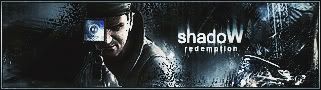
    1. Text - shadoW- then some where different on the sig put- RedempTion
    2. Font - sharp
    3. Colors - black, blue, white...
    4. Style - Dark, Icy...
    5. Border - if it looks good
    6. Animation - sure
    7. Dislikes - dont like it blury.. no bright colors
    8. Theme - Americas Army - Wolf
    9. Other - Make sure it has something to do with americas army and also has a white wolf some where on it..
    10. Avatar - Doesnt have to have americas army them.. But id like it to look the same as the sig, maybe with a wolf on it, if possible.


    I tried a new style of default brushing and coloring here... I hope you'll like it, cuz I'm loving it

  2. #2
    Join Date
    Aug 2005
    Location
    HK
    Posts
    2,353

    Default

    LOL, I never would have thought Metal would do any requests.. :P
    Anyway, I really love it too, and I bet the guy would love it too. I really like the text, oh and the brushing. Fantastic work.
    Basically, I love everything about it, bah.


    <3 Fuzzy

  3. #3
    Join Date
    Apr 2005
    Posts
    5,855

    Default

    thanks

  4. #4
    Join Date
    Jun 2005
    Location
    NSW, Australia
    Posts
    3,262

    Default

    Damn that&#39;s nice, it&#39;s perfect, no real crit from me Great job

  5. #5
    Join Date
    Sep 2005
    Posts
    233

    Default

    i love it. awesome job. i especially like how the dark blue works with everything.

  6. #6
    Join Date
    Apr 2005
    Posts
    5,855

    Default

    thanks

  7. #7
    Join Date
    Sep 2005
    Posts
    261

    Default

    I like a lot, specially the render bleending wit the bg so cool!

  8. #8
    Join Date
    Aug 2005
    Posts
    100

    Default

    i like it !
    only thing putting me off is the brushing to the left of the stock

  9. #9
    Join Date
    May 2005
    Location
    Texas.
    Posts
    1,584

    Default

    I like how the color scheme fits the render well. I also really like that brushing, nice job man!
    Current Tag:


    Are you a deviant?
    I am
    www.firetap.deviantart.com


  10. #10
    Join Date
    Jul 2005
    Location
    Virginia
    Posts
    1,667

    Default

    looks nice, good job man.

Posting Permissions

  • You may not post new threads
  • You may not post replies
  • You may not post attachments
  • You may not edit your posts
  •  
Powered by vBadvanced CMPS v4.1.1