0 members and 1,156 guests
No Members online

» Site Navigation

» Stats

Members: 35,442
Threads: 103,075
Posts: 826,688
Top Poster: cc.RadillacVIII (7,429)
|
-

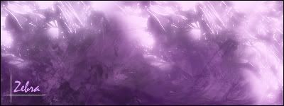
hey everyone, this is a sig i made today in my english class. i was trying to create depth and contrast. cause lots of people told me that my sigs didnt have any, i think i achieved that, maybe, not sure though. let me know what you think. thanks ... ohh and should i current? i might enter it in the sotw contest too. i dunno. cnc please

-

the sparkle brushing is to random imo, u need to crop the tag and make a clear focal point, also work on the text, change the font and remove the lines.
-

your english class has photoshop?? awesome!
anyway, the sparkle brushing is random like trice said, and it looks like you used the same one a few times too many...
also, try using some more colors, or change the current ones, white and purple dont really compliment each other very well IMO.
establish a clear focal point like trice said, theres nothing there of significant interest.
one thing i do like is the lines. its a good idea IMO, but its all about the placement. Also, work on the text
keep trying 
-

Originally posted by kompakt@Oct 28 2005, 10:01 PM
your english class has photoshop?? awesome!
anyway, the sparkle brushing is random like trice said, and it looks like you used the same one a few times too many...
also, try using some more colors, or change the current ones, white and purple dont really compliment each other very well IMO.
establish a clear focal point like trice said, theres nothing there of significant interest.
one thing i do like is the lines. its a good idea IMO,* but its all about the placement. Also, work on the text
keep trying 
[snapback]89527[/snapback]
What he said.
-

my big issue is the colors... try to incorporate more colors to make it more lively... the brushing is a little random too, but that'll come with practice. keep at it.
-

It feels to plain to me....try to put a stock in it if you could.
-

i think your size is too big make your sigs a bit smaller and i agree with all the colour complaints and itis better than your current
-

It is a tad flat, try reading some tuts, using dodge, burn, focal points, smudge, renders, filters, try something new! Let your photoshop take you into its hidden depths! Its the only way you'll learn.
-

thanks for the replies everyone, im gunna work on everything yall just told me to do in the next one, but just so you know, i made this one in photosop elements 3.0. which was hard to do, but hopefully the next one will be better, thanks.
-

im praying that you have a full version of photoshop....elements is evil..
 Posting Permissions
- You may not post new threads
- You may not post replies
- You may not post attachments
- You may not edit your posts
-
Forum Rules
|


 Reply With Quote


