0 members and 3,765 guests
No Members online

» Site Navigation

» Stats
Members: 35,442
Threads: 103,075
Posts: 826,688
Top Poster: cc.RadillacVIII (7,429)
|
-

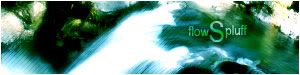
Fiddling around with various things...
This ones too messy for my likings, but I guess it was okay for a test.
I was trying to get a dreamy effect with these, but it didn't work properly.

Any hints, etc.?
-
-
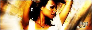
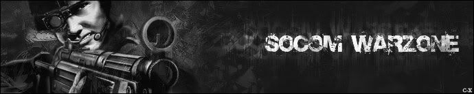
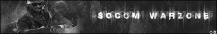
Banner request  . I used brushes for once - Personally I prefer the challenge of not using them . . I used brushes for once - Personally I prefer the challenge of not using them .
-
i kinda like the first one.. not sure what it is, but i kinda like it :P
as far as the "dreamy" effects... i think the 3rd looks most like what you're going for... but instead of a hazy/dreamy effect you have more of a clouded effect..
(haven't tested this out) but maybe try and put ripples or some sort of filter in there to give it that dreamy/wavy effect overtop of the render and bg to get a better effect...
-
Yeah, I'll try something like that. I was also thinking maybe a liquified layer set to overlay over it all? Dunno.
Thanks for your comments .
-
yeah thats what i was sorta gettin at... somethin of the sort that you can overlay to give it more of a hazy look as opposed to a cloudy/misty look...
as for the other edits you've made, i love the "newest" sig... just like the flow of it all together, maybe not the big 's' so much, but otherwise very nice
the banner is pretty good too, but i'm generally not too big of a fan of colorless work... looks pretty nice though
-
Yeah, thanks. . Big S was me trying to be creative, but I don't think it worked out. It was originally going to be FlowS sideways and Spluff verticle from the S, but there was no good positioning for it.
The banner request was supposed to flow with the site, so it was either going to be black and white, or yellow. I don't know about you, but I'm not the biggest fan of an entire yellow thing.  . .
-
hahaha good call then, good choice
how bout for your text arch it to flow with that green area instead of going straight horizontal arc it a little
 Posting Permissions
- You may not post new threads
- You may not post replies
- You may not post attachments
- You may not edit your posts
-
Forum Rules
|


 Reply With Quote