GFXVoid Graphic Design Forum

Remove Text Formatting
Loading...

» Online Users: 26,370

0 members and 26,370 guests
No Members online

» Site Navigation

 > FAQ

» Stats

Members: 35,442
Threads: 103,075
Posts: 826,688
Top Poster: cc.RadillacVIII (7,429)
Welcome to our newest member, Lekelindids
Results 1 to 8 of 8

Thread: 2 newest

  1. #1
    Join Date
    Aug 2005
    Location
    Florida
    Posts
    189

  2. #2
    Furious Guest

    Default

    Wowm,those are so kick ass!!!Teach me please..

  3. #3
    Join Date
    Jul 2005
    Posts
    234

    Default

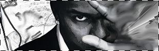
    wow nemesis, that first one feels a little too original. I dont think the world is ready for it :P Kanye kicks ass btw!

    The second one is so great, I'm lovin it.

  4. #4
    Join Date
    Apr 2005
    Location
    long a
    Posts
    1,642

    Default

    First one is way too messy and whacked. There is no flow or direction.

  5. #5
    Join Date
    Oct 2005
    Location
    Australia
    Posts
    330

    Default

    i don't like the random cut of the face or the brushey things which look to sharp and pixely- kinda like old skool on new skool

    YOur current is way better

  6. #6
    Join Date
    Oct 2005
    Location
    England
    Posts
    101

    Default

    the first one and everything on the left is sweet.

  7. #7
    Join Date
    Jul 2005
    Location
    Virginia
    Posts
    1,667

    Default

    first one is interesting but pretty messy, 2nd is cool, not much to about it. Nice job.

    P.S. are we going to battle or what, im waiting :P

  8. #8
    Join Date
    Apr 2005
    Posts
    367

    Default

    Uhh, I'm not feelin these, to much going on in the first one, and the colors dont flow..neither does the BG, idk...text is eehh too..on the 2nd on the BG needs works.

Posting Permissions

  • You may not post new threads
  • You may not post replies
  • You may not post attachments
  • You may not edit your posts
  •  
Powered by vBadvanced CMPS v4.1.1