0 members and 26,370 guests
No Members online

» Site Navigation

» Stats
Members: 35,442
Threads: 103,075
Posts: 826,688
Top Poster: cc.RadillacVIII (7,429)
|
-

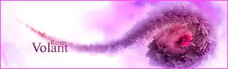
I think it is my best smudge sig... Left side might be a tad empty, but I can't think of anything to fill in there.
...yes?
-
really nice sig, could add abit more contrast in parts maybe...
hippy
-
Dont change anything, I like it as it is 
-
love it man, excellent work.
-
That's pretty cool man gj, keep it up.
-
That's nice. Here's a few tips you can use if you want:
The border could be black, or another color. This keeps the focus on the color of the sig instead of its distracting frame.
The color needs to be desaturated and mixed with another soft one to make it look soft too.
You can try using a Selective Color layer. (Layer>New Adj. Layer>Selective Color), and mess with all the sliders until you get the look you like.
Plus, I think it would be a little better if the flower had a little space from the bottom of the sig, like it has from the top.
-
metal has got everything there, and i don't think the left side is empty it is good how it is, you don't want to make it too cluttered
-
Originally posted by Metal
The color needs to be desaturated and mixed with another soft one to make it look soft too.
What do you mean?
Anyway, I messed around witht the Selective Color layer and changed the colors rather drastically. The title (rose) doesn't fit as well anymore.
I couldn't move it further up without having to make the area below it from scratch, but I could crop the height... *shrugs*

-
The original is better in my opinion, don't like the colours of the new one
-
very nice work.. can't really think of anything to add...
stick with your first though.. your updated colors aren't too great.
 Posting Permissions
- You may not post new threads
- You may not post replies
- You may not post attachments
- You may not edit your posts
-
Forum Rules
|


 Reply With Quote


