GFXVoid Graphic Design Forum

Remove Text Formatting
Loading...

» Online Users: 2,336

0 members and 2,336 guests
No Members online

» Site Navigation

 > FAQ

» Stats

Members: 35,442
Threads: 103,075
Posts: 826,688
Top Poster: cc.RadillacVIII (7,429)
Welcome to our newest member, Lekelindids
Results 1 to 6 of 6
  1. #1
    Join Date
    Apr 2005
    Posts
    5,855

  2. #2
    Join Date
    Nov 2005
    Posts
    41

    Default

    looks really nice, i like it alot.

  3. #3
    Join Date
    Aug 2005
    Location
    Nyköping, Sweden
    Posts
    1,908

    Default

    the render should be a bit more brighter imo
    other then that its really nice

  4. #4
    Join Date
    May 2005
    Location
    Manitoba, Canada
    Posts
    724

    Default

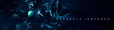
    It was a collab between me and him. Check the other art section for full view.

    Whatever though, I slapped together a SECRETLY LUMINOUS sig too for the fun of it.


  5. #5
    Join Date
    Apr 2005
    Posts
    1,891

    Default

    i like 2nd version.... but the txt colour drags its attention to the right side


  6. #6
    Join Date
    Apr 2005
    Location
    Behind my desk Status: nub
    Posts
    2,978

    Default

    text sucks and sharpen it :O?

    nice concept tho

Posting Permissions

  • You may not post new threads
  • You may not post replies
  • You may not post attachments
  • You may not edit your posts
  •  
Powered by vBadvanced CMPS v4.1.1