GFXVoid Graphic Design Forum

Remove Text Formatting
Loading...

» Online Users: 3,735

0 members and 3,735 guests
No Members online

» Site Navigation

 > FAQ

» Stats

Members: 35,442
Threads: 103,075
Posts: 826,688
Top Poster: cc.RadillacVIII (7,429)
Welcome to our newest member, Lekelindids
Results 1 to 10 of 10

Thread: WOLVERINE

  1. #1
    Join Date
    Apr 2005
    Posts
    1,891

    Default

    Fomething half-descent finally


  2. #2
    Join Date
    Jul 2005
    Posts
    234

    Default

    god damn...

    Just lend me a tiny bit of your skill for an hour. Or atleast tell me how you do it. XD

    Seriously though I'm loving this sig, wolvy might be a lil too contrasted in comparison to the rest of the sig though.

  3. #3
    Join Date
    Jan 2006
    Posts
    17

    Default

    pretty cool.. i think the text could be a bit more legible tho

  4. #4
    Join Date
    Jan 2006
    Location
    -E-Town
    Posts
    310

    Default

    theres text?


    I Go by Homicide On Other forums

  5. #5
    Join Date
    Apr 2005
    Posts
    347

    Default

    sex. sex. and more sex. colors are bootiful and everything else rocks, help me im just a poor nub :P

  6. #6
    Join Date
    Jun 2005
    Location
    NSW, Australia
    Posts
    3,262

    Default

    Looks really cool man, just lose the text.

  7. #7
    Join Date
    Sep 2005
    Location
    Suburbs Minnesota
    Posts
    433

    Default

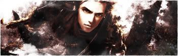
    perfect man its the best wolverine sig i've seen not sure about the text that could be better but im just wondering whats the name of that font anyway

  8. #8
    Join Date
    Apr 2005
    Location
    Springfield, MO
    Posts
    1,736

    Default

    You know in truth I think this is the first sig from you in awhile now I l don't like. Just something about the the lower left side bugs me for some reason. Looks like you might of smudge that spot in a different manner then the others. Bug me, I don't know, its stupid on my part though I guess. Colors are nice and the stock and effects coming off it is gold though.

  9. #9
    Join Date
    Apr 2005
    Posts
    1,891

    Default

    Okay, ima make this clear to you guys; the lower left is his CLAWS!

    you might not see it because of the heavy editing I did, but its there NONE THE LESS!

    http://www.marvel.com/wallpaper/fetchimage...id=178&size=med


  10. #10
    Join Date
    Jan 2006
    Posts
    130

    Default

    that is kick ass man... i love it. gj on the bg and the render blend :P
    but im not to fond with the text. Work on that and it will be amazing

Posting Permissions

  • You may not post new threads
  • You may not post replies
  • You may not post attachments
  • You may not edit your posts
  •  
Powered by vBadvanced CMPS v4.1.1