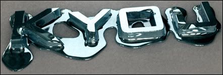
slim summed it up pretty nicely!Originally posted by Slim@Mar 22 2006, 05:52 AM
remove some of the brushing layers on the right maybe?* use some softer brushes, maybe some dirt and dust type of brushes would work better than whatever was used on the right side.* also the text is really hard to read, i would make it more noticable or something.* good sig though, but it could use some work.
[snapback]116571[/snapback]


 Reply With Quote