0 members and 903 guests
No Members online

» Site Navigation

» Stats
Members: 35,442
Threads: 103,075
Posts: 826,688
Top Poster: cc.RadillacVIII (7,429)
|
-

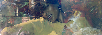
I was trying do alot of different stuff and came up with this..C&C
-
u need some contrast, it all seems to be a meld of the same colour, rub out the thing blended on her head, other than that its alright, just needs to stand out more
-
Hope you don't mind i messed around with it for a few minutes. I just added a couple of gradient maps on soft light and other blending modes, added a brightness and contrast layer to make it a bit darker and more contrasted, messed with the colours, added lighting, text, a highlight or two, and a bit more.
[/b]
Thanks thats looks pretty good.. 
-
it's ok, but the colours make me feel like i have just vomitted and thats what came out. Just to clarify the sig isn't bad the colours are.
 Posting Permissions
- You may not post new threads
- You may not post replies
- You may not post attachments
- You may not edit your posts
-
Forum Rules
|


 Reply With Quote


