GFXVoid Graphic Design Forum

Remove Text Formatting
Loading...

» Online Users: 2,458

0 members and 2,458 guests
No Members online

» Site Navigation

 > FAQ

» Stats

Members: 35,442
Threads: 103,075
Posts: 826,688
Top Poster: cc.RadillacVIII (7,429)
Welcome to our newest member, Lekelindids
Results 1 to 6 of 6

Thread: Aquatic Gold

  1. #1
    Join Date
    Nov 2005
    Location
    Norway
    Posts
    108

    Default


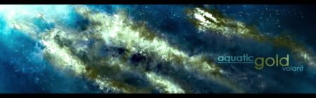
    All smudge, as usual.

    All comments appreciated.

  2. #2
    Join Date
    Apr 2005
    Posts
    1,891

    Default

    looks pretty good, dont like txt though.


  3. #3
    Join Date
    Jun 2005
    Location
    U.K.
    Posts
    3,462

    Default

    it's ok..
    add more black to enhance the depth..

  4. #4
    Join Date
    Apr 2005
    Location
    Springfield, MO
    Posts
    1,736

    Default

    Tend to agree with Lumix. Though I think if you just did a quick once over in afew places with the burn tool that would work just as well.

  5. #5
    Join Date
    Apr 2005
    Location
    NSW, Australia
    Posts
    1,511

    Default

    yeh needs a bit more darkness and text needs fixing.


  6. #6
    Join Date
    Dec 2005
    Posts
    68

    Default

    gold doesnt fit the blue background ;(

    idea is nice

Posting Permissions

  • You may not post new threads
  • You may not post replies
  • You may not post attachments
  • You may not edit your posts
  •  
Powered by vBadvanced CMPS v4.1.1