0 members and 316 guests
No Members online

» Site Navigation

» Stats
Members: 35,442
Threads: 103,075
Posts: 826,688
Top Poster: cc.RadillacVIII (7,429)
|
-
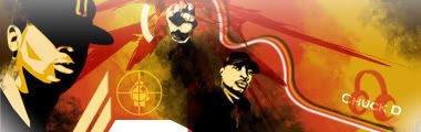
 my best? my best?

tried something different....
-
No.
not bad though. but not great.
I like the box-heads, but I don't think they fit -- or they could be minimized, because they are taking up the space of the focal point.

 ... With the exception of this stamp.
-
-
i like it but maybe tone down the yellow effects? looks good tho
-
i think theres an idea there but it needs more
i like the whole yellow line thing around his shoulders and lower arm, but the rest is a lil messy...
maybe get rid of all the random lines and try to encorporate some effects with the good non random lines
but definitly a nice job
"The only verdict is vengeance; a vendetta, held as a votive, not in vain,
for the value and veracity of such shall one day vindicate
the vigilant and the virtuous." - V
"Roll dat shyt, lite dat shyt, smoke it" - Method Man
My Girl
-
I see a bit of Spid3r style, the yellow squiggly lines =P
But yeah, you went overboard with the lines on the left. The right looks okay though. Not bad but definitely not your best 
-
kk thx guys... and handnt thought about spiders stuff.. but yeh i guess it does look a lil like his.
-
I see you've finally put your love of the pen tool to work
nice
ArE yOu WiSe EnOuGh To WeAr A wIsEhAt?
-
lols no pen tool used... cant use it worth a f*uck... all freehand with the mouse and the brush tool... 1/2pxls
-
umm ye lots off yellow square faces hmmmm lol no its pretty good but its just not quite there its a first gooa t this sort of thing so keep going!
Latest
-------

-------

 Posting Permissions
- You may not post new threads
- You may not post replies
- You may not post attachments
- You may not edit your posts
-
Forum Rules
|


 Reply With Quote