0 members and 670 guests
No Members online

» Site Navigation

» Stats
Members: 35,442
Threads: 103,075
Posts: 826,688
Top Poster: cc.RadillacVIII (7,429)
|
-
-

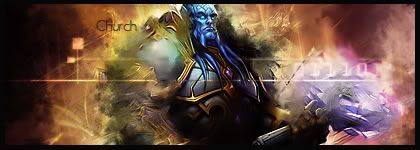
Ah, dunno what to say. Colors dont match.
Effect looks nice on his face, but not on his gun.
Text is maplaced and stands out too much imo.
But nice try^^ keep up the work
-
I like it actualy, I agree the render may not have been the best, but. It gives me a feeling that he's disappearing, same with the end of the gun. Good job : ) The only thing that I see dont fit, is probably the text.
Latest:

-
The gun just ended where I put the effects so had to do something, also I know the text sucks so hard to get it looking good on a sig like that >.<
Thanks Fire
-
Requests are always hard. One cause most times you don't like the render choice..and two just because they are usually very demanding.
As far as requests go i think you did well, they are hard to pull off and with such a difficult render you did well.
 My DevART
RATCHET is my bitch
Andrew says:
u ever stolen a bible?
Apathy says:
no
used the last two pages to roll a joint though
Andrew says:
wow
thats fucking hard core
^^HAHAHA, dm sucks XD
-
I think whats throwing me off the most must be the orange and purple colors  try to take that off? and hit us with an update. try to take that off? and hit us with an update.
-
I'd like to see the original render if you could.
-
Thanks Fire
-
yea, tough render there.
maybe center it more and just coulda done some smudging on the back shoulder to blend it in.
This way the gun would just end at the right edge of the sig.
Similar Threads
-
By PlayerBrooker in forum Sigs & Manips
Replies: 3
Last Post: 03-24-2008, 08:44 AM
-
By Frozen in forum Sigs & Manips
Replies: 4
Last Post: 08-28-2007, 09:20 PM
-
By Ryzee in forum Digital Art
Replies: 4
Last Post: 10-13-2005, 05:47 AM
-
By imported_Atheuz in forum Sigs & Manips
Replies: 7
Last Post: 10-04-2005, 10:24 AM
 Posting Permissions
- You may not post new threads
- You may not post replies
- You may not post attachments
- You may not edit your posts
-
Forum Rules
|


 Reply With Quote


