0 members and 1,931 guests
No Members online

» Site Navigation

» Stats
Members: 35,442
Threads: 103,075
Posts: 826,688
Top Poster: cc.RadillacVIII (7,429)
|
-
 New sigs. Very pleased, =/ New sigs. Very pleased, =/
-
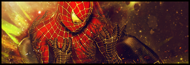
i liek spiderman but i'd turn down the saturation it hurts my eyes xD
-
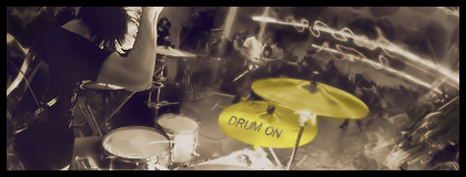
First one just looks really flat, no depth.
Second one looks sweet, nice effects and colors.
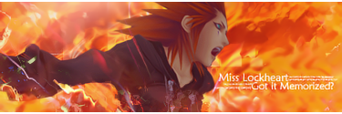
Third one just totally has the wrong colors man. Background looks cool though.
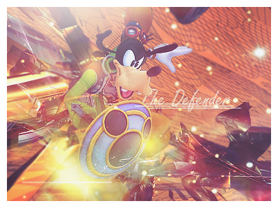
And the fourth one looks like a render slapped onto a background to me, try and get some more effects going on around the guy.
-
Pretty cool, liking the 2nd one the most, aside from her abdomen being a bit too blurry for a focus.
Also, Kyoushima, you have possibly the most awesome signature I've ever seen.
   Religion gives nothing in life, only in death.
-
I like the spider man, that looks good, but the colors are not that good try to do a sepia photofilter 
-
Similar Threads
-
By Krimsyn in forum Digital Art
Replies: 2
Last Post: 01-02-2006, 04:37 PM
-
By DragonsRage in forum Sigs & Manips
Replies: 6
Last Post: 08-22-2005, 08:14 PM
 Posting Permissions
- You may not post new threads
- You may not post replies
- You may not post attachments
- You may not edit your posts
-
Forum Rules
|


 Reply With Quote


 Wish I could say I made it myself though.