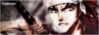
It not bad, its just when your render is that large you dont have room for many effects wich can make it seem boring but i like the grungy effect of it, needs a bit blending though, looks like it have none
IT's good you are using a small canvas. I would try making even smaller tbh. When you are learning photoshop If you use a smaller canvas it will look more packed in and so the effects will look more broad.
You also might wanna make your renders a bit smaller. When they take up 80-% of the sig, you really don't have a ton of room to play around in.
You might wanna lay off of the gaussian blur a bit. I know it looks cool and gives it that dreamey effect, but it's pretty noticable and easy to spot.
Your backgrounds on these sigs look solid, and the effects are okay. Hell your text is even pretty good, Nice job using deafults!!! Wohoo!
Next sig work on your beldning a bit. If you would like a bit of help MSN me. I'd be willing to work with ya a bit.
hey man...trying to incorporate new things into your style..and making them look good is the hardest thing:P...trust me...
read tuts....you dont have to even try them all the time...just get inspired by how they do certain things...and try doing those things in your own way.


 Reply With Quote
 but i like the grungy effect of it, needs a bit blending though, looks like it have none


