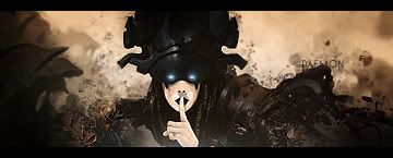
Well, what first strike me is that the render just looks slapped on. and colors do not match really well. You should do some blending to make the bg flow better with the render. Ehhm regarding the text, try not seperating the text all around the sig, cuz its gonna be to messy and focal point is harder to find.


 Reply With Quote