0 members and 900 guests
No Members online

» Site Navigation

» Stats
Members: 35,442
Threads: 103,075
Posts: 826,688
Top Poster: cc.RadillacVIII (7,429)
|
-
 Halo 3 newest sig , check it out Halo 3 newest sig , check it out
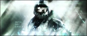
i think it's pretty good
-
-
-
IMO this is too over contrasted. The whites are blown out. IF you fix the contrast things will kinda fall into place i think.
ALso the BG is very very blurred. you might wanna get rid of that a litte (you want some, but not the whole BG). Good effects though, and the coloring looks nice as well.
The text is pretty good too, but placement wise i would put the word chief directly next to master. And then put eagles directly below it, and then make them botht the same length.
Overall though nice job. Just tone down the blur.
 My DevART
RATCHET is my bitch
Andrew says:
u ever stolen a bible?
Apathy says:
no
used the last two pages to roll a joint though
Andrew says:
wow
thats fucking hard core
^^HAHAHA, dm sucks XD
-
i put the contrast alll the way down and it didn't change it much at all,
Similar Threads
-
By Trikato in forum Sigs & Manips
Replies: 14
Last Post: 10-05-2007, 07:23 PM
-
By PatDaniels in forum Sigs & Manips
Replies: 3
Last Post: 02-25-2007, 02:10 AM
-
By Dragon in forum Sigs & Manips
Replies: 2
Last Post: 10-18-2006, 02:19 PM
-
By ZeekUnreloaded in forum Digital Art
Replies: 8
Last Post: 07-31-2005, 12:11 AM
-
By ZeekUnreloaded in forum Digital Art
Replies: 1
Last Post: 07-27-2005, 09:50 PM
 Posting Permissions
- You may not post new threads
- You may not post replies
- You may not post attachments
- You may not edit your posts
-
Forum Rules
|


 Reply With Quote


