0 members and 688 guests
No Members online

» Site Navigation

» Stats
Members: 35,442
Threads: 103,075
Posts: 826,688
Top Poster: cc.RadillacVIII (7,429)
|
-
-

this one is actually like amazing. v1. aside from the text i loooooove it.
EDIT: you've inspired me. you reminded me how good warhammer art is.
Last edited by nazz; 07-28-2008 at 11:44 PM.
-
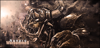
wow that necron one is sweet ^^
-
-
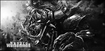
i like your font that you have but the text is a little hard to read cuz it fades out.
-
 Originally Posted by PC Sheef

i like your font that you have but the text is a little hard to read cuz it fades out.
Yeah, I didn't want it to stand out that much because I didn't want it to distract from the actual focal too much. The other versions text was kind of distracting to me.

////////////////////////////////////////////////////////////////////////////////////////////////////
-
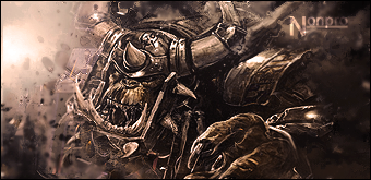
Very cool. I hate Orks in all fiction, but that's an undeniably cool sig. V3 ftw.
   Religion gives nothing in life, only in death.
-
very nice...i admire your style man..keep it up
-
Very nice work. Good sig but i think your text needs some work.
-
Very cool. Text needs work though. Also next sig you should try to make it really colorful! WHat i've seen from you is black and white and very sepia toned.
Aside from that though it looks very nice. Great job.
 My DevART
RATCHET is my bitch
Andrew says:
u ever stolen a bible?
Apathy says:
no
used the last two pages to roll a joint though
Andrew says:
wow
thats fucking hard core
^^HAHAHA, dm sucks XD
 Posting Permissions
- You may not post new threads
- You may not post replies
- You may not post attachments
- You may not edit your posts
-
Forum Rules
|


 Reply With Quote