0 members and 699 guests
No Members online

» Site Navigation

» Stats
Members: 35,442
Threads: 103,075
Posts: 826,688
Top Poster: cc.RadillacVIII (7,429)
|
-
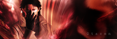
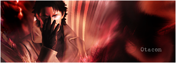
 Otacon from MGS4 Otacon from MGS4
As the titles says, Otacon from MGS4.
v1
v2
edit: I'm new, so advice would be nice.
Also, this is only my 2nd sig.
-
text is kinda bleh but the sig is good and basic.
-
Can you give me some names of fonts that would go with the flow?
Hmm...basic because I only started recently... =P
-
-
-
The BG(background) goes pretty well with the render.
The blending is okay however the lighting is off.
Try adding a light to the top right, in the middle of the sig. There are a few different ways to do this my favorite is:
use a soft (0% hardness) 100 px 80% opacity brush.
create a new layer and fill it black and set it to linear dodge
brush once in the color you want your lightsource to be.
I think you should read up on the rule of thirds. Compositionally i think you need more bretahing room between the border and the render.
Wikipedia rule of thirds
Finally a good text that would work well with this would be something like arial, or eurose (if you have it).
But text is hard to learn when you still beggining a more imortant focus is the rest of the sig.
 My DevART
RATCHET is my bitch
Andrew says:
u ever stolen a bible?
Apathy says:
no
used the last two pages to roll a joint though
Andrew says:
wow
thats fucking hard core
^^HAHAHA, dm sucks XD
Similar Threads
-
By zole in forum Sigs & Manips
Replies: 2
Last Post: 07-20-2008, 10:31 AM
-
By bigladanderton in forum Sigs & Manips
Replies: 0
Last Post: 08-29-2007, 04:41 PM
-
By Outlaw in forum Digital Art
Replies: 4
Last Post: 09-30-2005, 05:40 AM
-
By PP Bone in forum The Void
Replies: 7
Last Post: 09-21-2005, 07:35 AM
 Posting Permissions
- You may not post new threads
- You may not post replies
- You may not post attachments
- You may not edit your posts
-
Forum Rules
|


 Reply With Quote