0 members and 958 guests
No Members online

» Site Navigation

» Stats
Members: 35,442
Threads: 103,075
Posts: 826,688
Top Poster: cc.RadillacVIII (7,429)
|
-
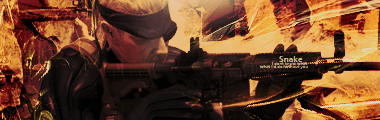
 Snake, MGS4 Snake, MGS4
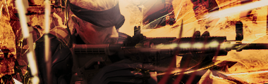
v2
Last edited by AntiEmperor; 08-11-2008 at 12:19 AM.
-
The background is very busy and contrasted leaving the render itself to look contrasted, i feel the colours are just a bit too strong. I like v2 but not the text remove it for a v3.
-
yeah exactly what ratchet said.
ur render doesn't stick out much, so try to bring it out more, how ratchet said.
-
How would you guys recommend bringing out snake more?
-
try sharpening the render and then blurring some of the BG. I Think your main problem is just that the BG is too busy. try going back through your PSD and taking out Unnecessary clutter.
The text doesnt bother me that much, however i think the coloring is a bet overwhelming. the orange is soo strong you should try to soften it a bit.
 My DevART
RATCHET is my bitch
Andrew says:
u ever stolen a bible?
Apathy says:
no
used the last two pages to roll a joint though
Andrew says:
wow
thats fucking hard core
^^HAHAHA, dm sucks XD
-
So I should have a B&W gradient map...maybe 20-30% opacity?
Similar Threads
-
By AntiEmperor in forum Sigs & Manips
Replies: 5
Last Post: 08-03-2008, 07:52 AM
-
By zole in forum Sigs & Manips
Replies: 2
Last Post: 07-20-2008, 10:31 AM
-
By bigladanderton in forum Sigs & Manips
Replies: 0
Last Post: 08-29-2007, 04:41 PM
-
By Outlaw in forum Digital Art
Replies: 4
Last Post: 09-30-2005, 05:40 AM
-
By PP Bone in forum The Void
Replies: 7
Last Post: 09-21-2005, 07:35 AM
 Posting Permissions
- You may not post new threads
- You may not post replies
- You may not post attachments
- You may not edit your posts
-
Forum Rules
|


 Reply With Quote


