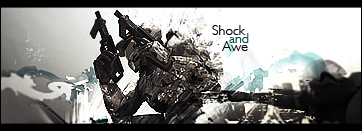
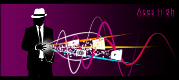
I like the color choices, but i feel like they could be even bolder still. the smudging of the background is well done, but IMO doesn't hold enough color to match the cartoony nature of the render. I like your text, but maybe move it to the left a little. I like the right side of the sig, especially immediately along the render's edge. keep it up!


 Reply With Quote