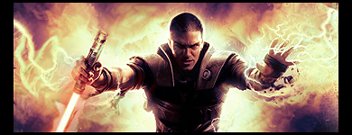
top one: a bit more contrast wouldnt hurt, as well as more to the BG. 6.5/10
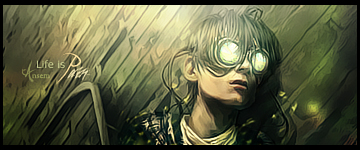
bottom one: dunno why really, but I love itOne of the best anime sigs I've seen in a while. 8/10
And your text actually looks pretty nice; most people tend to mangle that part.


 Reply With Quote