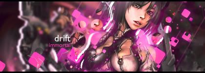
best analogy i ever sawYour second sig blows your first out of the water. No contest. The text on the first one is safe. It fits and it works though it would be cool to see something a bit more adventurous it's good because text like that works with every sig. I will say however to: stop putting your text in the corner. lol it bothers me and really almost like secludes it.
It's like when you are making a sandwich right? The bread is the border, the meat is the render, and the effects is the cheese. Well you dont put the ketchup, which in this case is the text, on the edge of your plate do you? No get it right in the middle of that sandwich so you can taste it all the way around.
lol I own at analogies hhaha.
Work on your lighting in sig 2. It looks as if its coming from the bottom but on his head oyu can clearly see the op of his head is brigther than the bottom. So watch out for that.
GJ on two for real it looks nice.


 Reply With Quote