GFXVoid Graphic Design Forum

Remove Text Formatting
Loading...

» Online Users: 4,855

0 members and 4,855 guests
No Members online

» Site Navigation

 > FAQ

» Stats

Members: 35,442
Threads: 103,075
Posts: 826,688
Top Poster: cc.RadillacVIII (7,429)
Welcome to our newest member, Lekelindids
Results 1 to 9 of 9
  1. #1
    Join Date
    Oct 2007
    Posts
    2,782

    Default Internal struggle

    V1:


    V2:


    B&W:


    Cnc please.


  2. #2
    Join Date
    Jul 2008
    Location
    Manchester, England
    Posts
    929

    Default

    V1 IMO but maybe blur the edges cos its all abit distracting and where is the text mate :S


  3. #3
    Join Date
    Oct 2007
    Posts
    2,782

    Default

    No text as it wouldn't fit. Too much going on.


  4. #4
    Join Date
    Apr 2008
    Location
    Lisbon, PT
    Posts
    359

    Default

    That c4d on the right...not good, it's too distracting..

  5. #5
    Join Date
    Oct 2007
    Posts
    2,782

    Default

    Quote Originally Posted by Lew View Post
    That c4d on the right...not good, it's too distracting..

    The blue one?


  6. #6
    Join Date
    Jul 2008
    Location
    Manchester, England
    Posts
    929

    Default

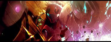
    i think that is what he means its why i said blur it and the shove some text in the bottom right maybe slanted or something with low opacity and if you get the fonts right it would OWN!


  7. #7
    Join Date
    Jan 2008
    Location
    Cali
    Posts
    523

    Default

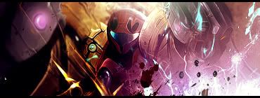
    im liking v1, the border seems like it's out of place but i think it's necessary. I like this kind of style, even tho left side seems dull. Maybe u can add some more things there? Also maybe blur some parts to bring the picture out o;?

    Anyway im really digging this 1. Good stuff man.

    SUN-KEN-ROCK


    http://jayteare.deviantart.com/

    Cosmosys
    Intrinsic Nature will be back soon no worries.
    Gifts

  8. #8
    Join Date
    Sep 2005
    Location
    Florida
    Posts
    349

    Default

    /agree with lew


    Tantum religio potuit suadere malorum.
    (To such heights of evil are men driven by religion) -Lucretius, De Rerum Natura


  9. #9
    Join Date
    Feb 2008
    Location
    Toronto, Canada
    Posts
    4,831

    Default

    i tink the c4d is a kickass part .
    v1 looks great.
    sure there's no text.
    but it looks great IMO.
    its a really chaotic sig, but i tink that fits the render.
    maybe u can blur the edges a bit, but every thing else looks great.


Similar Threads

  1. Internal struggle
    By ratchetnclank in forum Sigs & Manips
    Replies: 12
    Last Post: 06-13-2008, 03:36 PM
  2. internal
    By Elektrik in forum Digital Art
    Replies: 5
    Last Post: 04-19-2006, 01:19 PM
  3. Replies: 13
    Last Post: 01-17-2006, 01:03 PM

Posting Permissions

  • You may not post new threads
  • You may not post replies
  • You may not post attachments
  • You may not edit your posts
  •  
Powered by vBadvanced CMPS v4.1.1