GFXVoid Graphic Design Forum

Remove Text Formatting
Loading...

» Online Users: 1,595

0 members and 1,595 guests
No Members online

» Site Navigation

 > FAQ

» Stats

Members: 35,442
Threads: 103,075
Posts: 826,688
Top Poster: cc.RadillacVIII (7,429)
Welcome to our newest member, Lekelindids
Page 183 of 496 FirstFirst ... 83133173181182183184185193233283 ... LastLast
Results 1,821 to 1,830 of 4959
  1. #1821
    Join Date
    Jul 2008
    Location
    Manchester, England
    Posts
    929

    Default

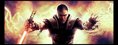
    7.5/1- i like the colours and the effects but text is abit bit

    8/10 i like your idea it just needs touch ups i could see this owning a large pic


  2. #1822
    Join Date
    Jul 2007
    Location
    Lithuania
    Posts
    3,611

    Default

    6/10 too much topaz I think

    8/10 looks great. just dont know about focal :/


  3. #1823

    Default

    too much c4d looking for me
    5/10
    †God Bless†


    ~See through eyes, unclouded by hate~

    my deviant art
    http://t-john316-t.deviantart.com/


  4. #1824
    Join Date
    Jul 2008
    Location
    Vancity, Canada
    Posts
    2,985

    Default

    Top: 8/10 - Very abstract and chaotic which is what you want in a white BG sig.
    Bottom: 7/10 - Most of it is great but you put way to much black space in the sig. :P
    Quote Originally Posted by MarkPancake View Post
    MarkPancake banned.
    Success.

  5. #1825

    Default

    Top- 8.9(repeating) good flow and c4d usage is top notch. Tone down the lighting abit imo

    Bottom:
    7.8/10 Nice. Could do with different fonts for textand c4d usage isnt very well done in this 1

  6. #1826
    Join Date
    Jul 2007
    Location
    Lithuania
    Posts
    3,611

    Default

    No sig


  7. #1827
    Join Date
    Aug 2008
    Location
    California :D
    Posts
    47

    Default

    I like it
    Good color choice, considering this month haha
    maybe tone down that lighting at the top a little bit imo?
    great job though 8.5/10
    -=||latest||=-

    -=||fav||=-

    -It's party time-
    evan [[EPIC]]

  8. #1828
    Join Date
    Jan 2008
    Location
    Lithuania, Dusetos
    Posts
    732

    Default

    Like blending on the right side.
    But I don't like the left side.Center is a bit empty.
    Text need work too.
    Overall it's good
    7.2/10
    [LEFT]

  9. #1829
    Join Date
    Feb 2008
    Location
    Toronto, Canada
    Posts
    4,831

    Default

    7/10 its wierd...sorry man but there are some nice effects on it.


  10. #1830
    Join Date
    Sep 2008
    Location
    Frankfurt, Germany
    Posts
    41

    Default

    8,5/10 love it!
    8/10


Similar Threads

  1. Rate The Sig Above!
    By SgtSwabs in forum The Void
    Replies: 16
    Last Post: 12-06-2005, 08:42 PM
  2. *NEW* Rate Avatar? Rate Sig?
    By LunarPoet in forum Sigs & Manips
    Replies: 1
    Last Post: 06-23-2005, 12:31 PM
  3. Rate my Signature...
    By Xavier in forum Sigs & Manips
    Replies: 8
    Last Post: 06-03-2005, 01:46 AM

Posting Permissions

  • You may not post new threads
  • You may not post replies
  • You may not post attachments
  • You may not edit your posts
  •  
Powered by vBadvanced CMPS v4.1.1