0 members and 517 guests
No Members online

» Site Navigation

» Stats
Members: 35,442
Threads: 103,075
Posts: 826,688
Top Poster: cc.RadillacVIII (7,429)
|
-
 New. New.
It's been awhile eh? MY computer with photoshop on it decided to go on it's monthly cycle and stop working...But I got it fixed so now I'm back! Woo!*Everyone Cheers*
-
Adam sandler is frigin awsome 
-
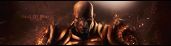
I was looking for CnC on the GoW one. xD not the adam sandler one :P
-
I really gotta quit putting my real name on my sigs, people are gonna start thinking I've been ripping you lol
The only thing that really doesn't catch my eye is the grey spot to the upper right of kratos. Lighting does always give depth, but it seems too bland for a dull, 50% grey spot to be in the middle of a darker, tan/orange sig. Only real suggestion I have, and its not exactly a bad thing, just a personal preference.
Love your style
-
Yea, I'll get on that lighting and no need to stop putting your real name on xD people can tell the difference in styles.
-
yup, other than the lighting it's pretty decent.
-
i like the style
keep working on it
-
This is pretty cool. the effects are SICK! you always do a good job with that. I would have prefered a more slick like text though. Maybe a sans serif font. Not bad though.
Light source is lacking. it looks like a white spot. But it's not glowing at all. it's not doign what a lightsource should be doing.
Brighten it up a bit more and i think it'd be ace.
 My DevART
RATCHET is my bitch
Andrew says:
u ever stolen a bible?
Apathy says:
no
used the last two pages to roll a joint though
Andrew says:
wow
thats fucking hard core
^^HAHAHA, dm sucks XD
 Posting Permissions
- You may not post new threads
- You may not post replies
- You may not post attachments
- You may not edit your posts
-
Forum Rules
|


 Reply With Quote


