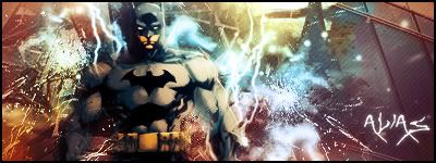
8.5/10
8,5/10 7/10
8/10 - Love the blending and the text is authentic Deathnote text. 6/10 - A little empty but again great blending and awesome text.
Originally Posted by MarkPancake MarkPancake banned. Success.
6/10 need more blending imo 7/10 great idea dig it to the max
SUN-KEN-ROCK http://jayteare.deviantart.com/ Cosmosys Intrinsic Nature will be back soon no worries. Gifts
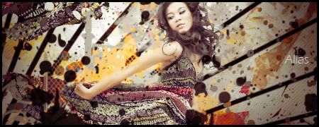
7/10 like it very different to the usal rectangle sigs. 5/10 just a bit cluttered with c4d's
new favs
actually there was only 1 c4d usage done in the last sig it's all brushes and the c4d usage was on the top left side on topic: 5/10 5/10 not really diggin the blending overcontrasted
ah kk ur second didnt show up was only the ichi one but still a bit cluttered imo 7/10 i like the way u have done ken in ur second sig looks very nice
hmm 4/10 3/10
God Bless ~See through eyes, unclouded by hate~ my deviant art http://t-john316-t.deviantart.com/
8/10 nice job
My best IMO Thx to flatty for depth tips My newest Collab Flatty and me
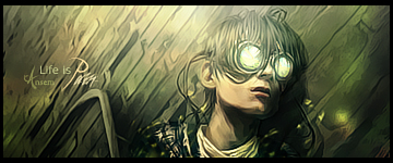
Would do with abit of sharpening, looks blurred to the right. 7/10 though.
Favorite Latest
Forum Rules


 Reply With Quote
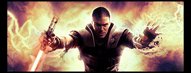


 and the c4d usage was on the top left side