0 members and 658 guests
No Members online

» Site Navigation

» Stats
Members: 35,442
Threads: 103,075
Posts: 826,688
Top Poster: cc.RadillacVIII (7,429)
|
-
-

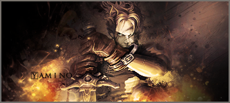
nice try to blur some parts and text is not so nice iff u ask me XD
-
awesome job, the colors and effects go really well with each other
Newest & Favorite

-
nice work, the flow and a lighting really suits ur sig well.. but i feel the top right corner cud have used a little finishing touches..
-
-
 Originally Posted by Tarquin

nice work, the flow and a lighting really suits ur sig well.. but i feel the top right corner cud have used a little finishing touches..
I couldn't have said it better.. great job with the flow!
-
Top right corner would be A+ is you just take a black brush and black it out and with 0% hardness.
Awesome flow and sick lightiung. Your effects look great. Overall this goes in the books as one of your best.
Nic JERB.
 My DevART
RATCHET is my bitch
Andrew says:
u ever stolen a bible?
Apathy says:
no
used the last two pages to roll a joint though
Andrew says:
wow
thats fucking hard core
^^HAHAHA, dm sucks XD
-
Similar Threads
-
By zole in forum Sigs & Manips
Replies: 6
Last Post: 08-15-2008, 03:40 AM
-
By XaiXo in forum Sigs & Manips
Replies: 1
Last Post: 08-07-2008, 02:43 PM
-
By YellowSubmarine in forum Digital Art
Replies: 1
Last Post: 09-21-2006, 05:01 AM
-
By `Kakashi in forum Sigs & Manips
Replies: 11
Last Post: 01-06-2006, 07:42 AM
-
By Oblivion in forum The Void
Replies: 10
Last Post: 03-12-2005, 05:38 AM
 Posting Permissions
- You may not post new threads
- You may not post replies
- You may not post attachments
- You may not edit your posts
-
Forum Rules
|


 Reply With Quote


