GFXVoid Graphic Design Forum

Remove Text Formatting
Loading...

» Online Users: 26,370

0 members and 26,370 guests
No Members online

» Site Navigation

 > FAQ

» Stats

Members: 35,442
Threads: 103,075
Posts: 826,688
Top Poster: cc.RadillacVIII (7,429)
Welcome to our newest member, Lekelindids
Results 1 to 4 of 4

Thread: -_-

  1. #1
    Join Date
    Oct 2008
    Location
    Holland
    Posts
    278

    Default -_-


    C&C *bows*
    Current


  2. #2

    Default

    nice, i like the spidy one. GJ
    .:Latest:.
    Gifts:
    - [Groo] [-] [-] [-] -


  3. #3
    Join Date
    Oct 2008
    Location
    Holland
    Posts
    278

    Default

    thanks and bumps
    Current


  4. #4
    Join Date
    Jan 2007
    Location
    Minnesota
    Posts
    5,091

    Default

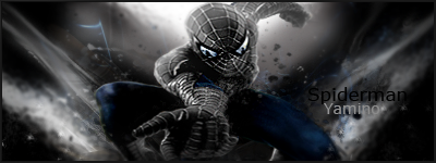
    Yamino i like the coloring. The blue+ black looks very evil in a cool way. The smudgign look pretty nice. the only thing i really disklike is the text. It's killing it for me. First off make it smaller and secondly why not use the spiderman font on a spiderman sig? It kind of seems foolish.
    Google Hamorahkan or something liek that.


    My DevART
    RATCHET is my bitch
    Andrew says:
    u ever stolen a bible?
    Apathy says:
    no
    used the last two pages to roll a joint though
    Andrew says:
    wow
    thats fucking hard core
    ^^HAHAHA, dm sucks XD


Posting Permissions

  • You may not post new threads
  • You may not post replies
  • You may not post attachments
  • You may not edit your posts
  •  
Powered by vBadvanced CMPS v4.1.1