


Originally Posted by Fork

you make me blush XD.
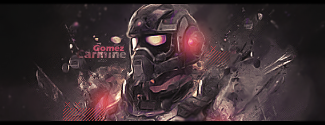
I gotta say the coloring is pretty bomb.
The effects are nice, and i like how you worked the scan lines in together.
I think you should erase the white line aroudn the top of his head. it's killing the blending right there.
The BG is bomb too. The only thing i dislike it the etxt. I realize you were going safe with the default looking font. But C'mon! lol. This is a case for a futuristic robot font. Bust out that robot font like micro n55 or somehting.
Otehr than that nice job it's a fantastic sig.


 Reply With Quote