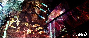
That looks really cool, may I suggest a yellow photo filter set to 100% with about 45% opacity, that would make all the colors fit a lot better. Other than that, love the flow and the general feel of the piece.
Text could also be a little smaller, it is taking my focus away from the filter.
lol this looks a lot like immo's green sig.
It's okay but the two red things shouldn't be there. or they should be smaller. Smaller = better in sigs always.
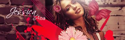
the butterfly works out nicely, but the spatter brushes shouldnt be there, it honestly looks like blood with hat red, and next to all those flowers and butterflies, really conveys a seperate message.
I really like everything except for those splatters, the red is so bright and different than the subtle pink.
It looks very tacked on.
Other than that it's pretty great! I like the flowers and the butterflies, and the lighting is very good.


 Reply With Quote